They say that knowledge is power, but it is never moreso than in the world of web analytics. Even in its most basic format, web analytics or even web counters can provide you with a decent level of traffic or visitation information …
Google has, for some time, been providing free access to its analytics system. This system provides enterprise level analytical data and links simply and easily with some of the other Google products such as AdWords or AdSense.
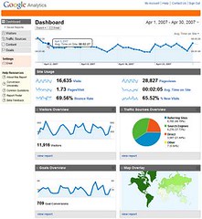
In an on-going effort to take over the world (while insisting on doing no evil), the Google folks have announced a revamp of the Analytics offering. As Meg reports, the new interface provides a host of new features including customised reporting/dashboards and enhanced trend/reporting.
From a quick look at the improvements to the integrated marketing analysis elements I was impressed. There are improvements around the "time with brand" type measurements, greater use of graphical analysis, better contextual help and more emphasis on linking campaigns to ecommerce results. I also like the way that that the world maps now have clickable heat maps showing the geographical locations of your visitors …
Now all I need to do is to design my own range of Servant of Chaos apparel and the world will be mine!
In an on-going effort to take over the world (while insisting on doing no evil) – so well put, i laughed for minutes :))
Yeah, Servant of Chaos t-shirts!!! 🙂
(And mugs and hats and bumper stickers…)
ready to place an order for mugs and t-shirts.
Thank God they still have the option to use the old analysis format, I found the new one a bit confusing and way too much for my needs. Guess I’ll have to get more lessons from the Servant next time I do your hair!
I think the new Google Analytics sucks: they just developed a cool product, without understanding its purpose and the users’ needs.
They fell in love with the product & features so much, they completely forgot about the end user. The result is an application that has the coolest features, is very powerful… and very cumbersome to use. It takes twice as many steps as before to get a report.
For instance, you can’t easily see the “inside day” chart of visitors (hourly data); you can’t easily see the geolocation of the visitors: it doesn’t help to know they came from the U.S. A lot of web sites are local in nature (or they run geolocalized marketing campaigns), so how about seeing how many visitors came from Kansas City, Jacksonville or Portland? With the new Analytics, you have to go through a few steps to get that simple data, which should be on the Dashboard; Also, the Traffic Source shows “search engines” and “referring sites,” which doesn’t help: which search engines? which referring sites? Now you have to go through a couple of steps to find that out.
It doesn’t help me that the New Analytics has a bunch more features and they’re really cool, when it’s a lot more cumbersome to use. When I use a product five times a day I can’t care less about how cool it is, I care a lot more about how functional it is. And the new Google Analytics is anything but functional.